




The rebrand marks a defining moment in MingZulu's own growth trajectory. It reflects the firm's promise to be anything but conventional: staying close to the work, sharing in risk and reward, and holding itself to one measure of success - the growth of those it serves.
"We started MingZulu because we got tired of seeing good businesses let down by the gap between advice and action. Smart thinking that never made it off the page. Over the last three years, we’ve built this firm to be different - to be the people who show up, stay in it, and do whatever it takes until real change happens. Thinking coupled with real action, underpinned by true grit. That's always been who we are, and now the brand reflects it."
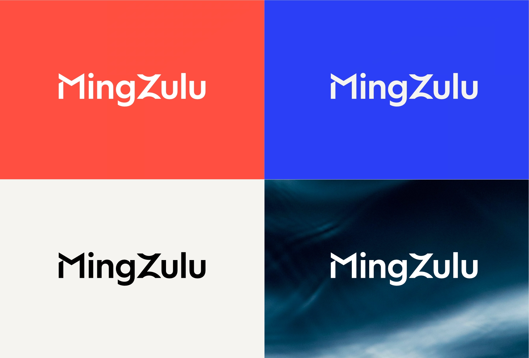
The rebrand brings the name MingZulu into full public expression for the first time, with the capitalisation of the Z making the two underlying ideas visible. Ming represents structure: the precision, architecture and thinking that provides the foundation. Zulu represents motion: the energy, direction and operational grit that turns that thinking into action and measurable impact. Two distinct forces, working together with one clear intention. The result is MingZulu: a brand built around the relationship between rigorous thinking and decisive action.
At the heart of the new brand is a single idea and tagline that doubles as a way of operating: Think in years. Move in months.
“Our new brand is the kind that stops you - but once it's got your attention, it delivers. It captures exactly who we are: structured enough to mean business, dynamic enough to move. But more than that, it reflects how we work. We get in alongside our clients and we build with them - strategy, capability, momentum, all of it co-created, all of it theirs to own long after we're gone. That's what integrated growth partnership means in practice. And that's exactly what this brand stands for.”
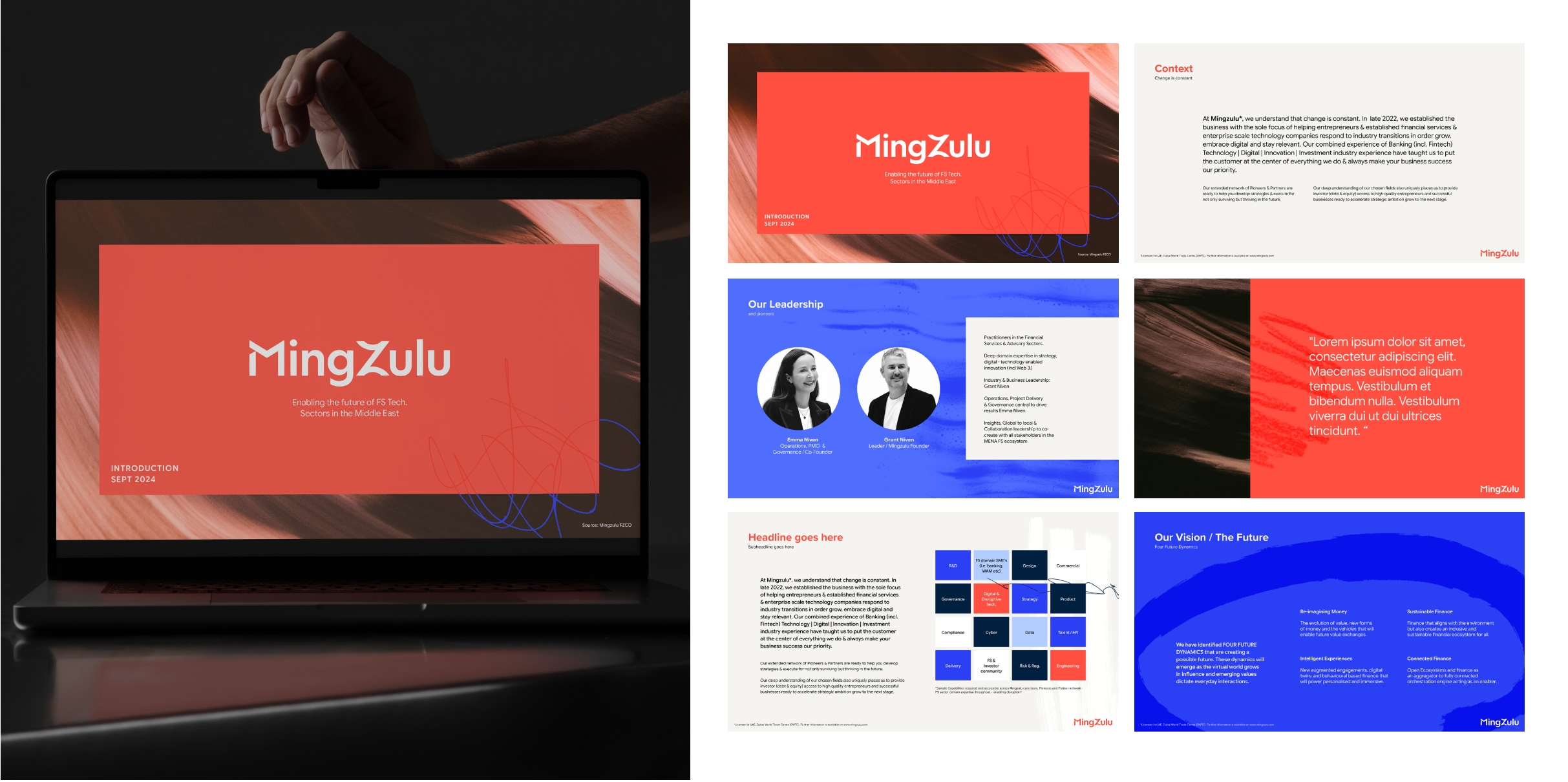
The new brand, developed by UAE-based brand strategy and communications consultancy Violet Rae, is a clearer expression of what MingZulu has become. The result is a brand, which encompasses a brand narrative and strategic framework, new logo, colour palette, typography, graphic elements, and imagery, built to reflect the vision of the founders while giving the business the platform and consistency to scale.
“There is a kind of visual uniform that advisory firms seem to have agreed to wear, but MingZulu has a very different cultural DNA, and the brand needed to make that visible. The vibrant, textured photography, human marks and deliberately visible traces of the work in progress sit alongside a level of polish that keeps the brand firmly in the world of serious business.
“That tension is important. It reflects the culture of the business itself. Considered, rigorous and ambitious, but also human, curious and full of character. Nothing has been added simply to make it look ‘different’. It’s there because it is uniquely MingZulu. In a category obsessed with looking credible, we thought the more interesting move was to make credibility feel alive. The result is a brand that makes an impression before it’s said a word.”
The launch of the new brand marks three years since MingZulu was founded to bring a fresh approach to growth advisory; combining board advisory, management consulting, and hands-on strategic support.